
Sprague's Kitchen Diner
This was the day that we moved into our new house...
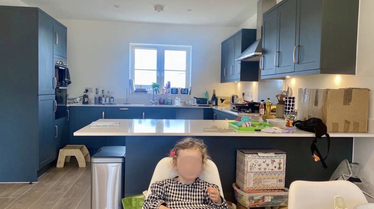
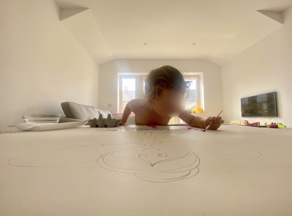
We had opted for dark green kitchen cabinets, brass handles and dark wood flooring but everything else was WHITE.
We spend a lot of time in our kitchen diner so I wanted it to feel like a welcoming, warm space for the whole family. I bought a lot of colour testers and started to create a mood board. With the dark geen cupboards, I wanted a softer colour on the walls. Pink and green are complimentary colours, and are opposite each other on the colour wheel. The two colours balance each other and are a perfect pairing for a kitchen. A soft, muted pink would add warmth to the room, and the green kitchen cupboards add freshness to the colour palette. Below was my initial mood board for the room.
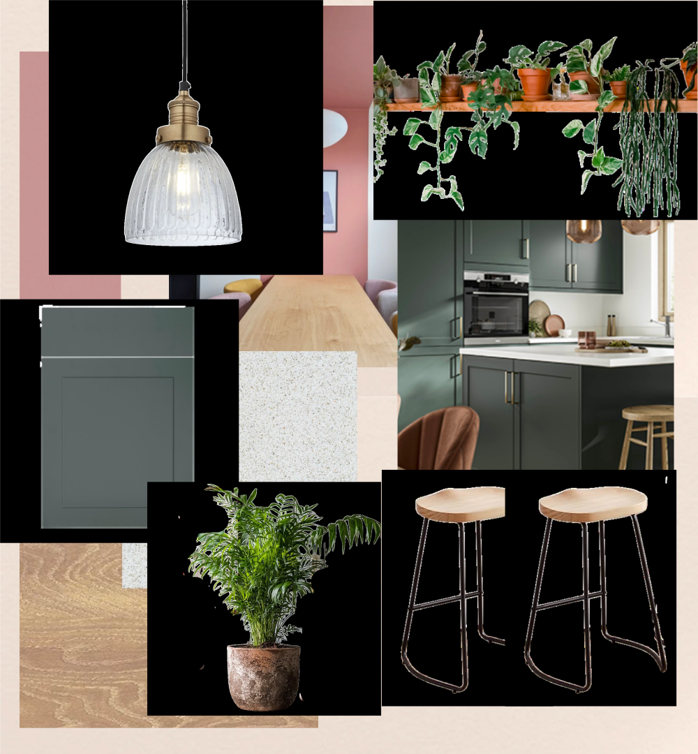
I settled with Lick Pink 01 and used this colour on all 4 walls. This was the video I sent my friend when we finished painting in the early hours!
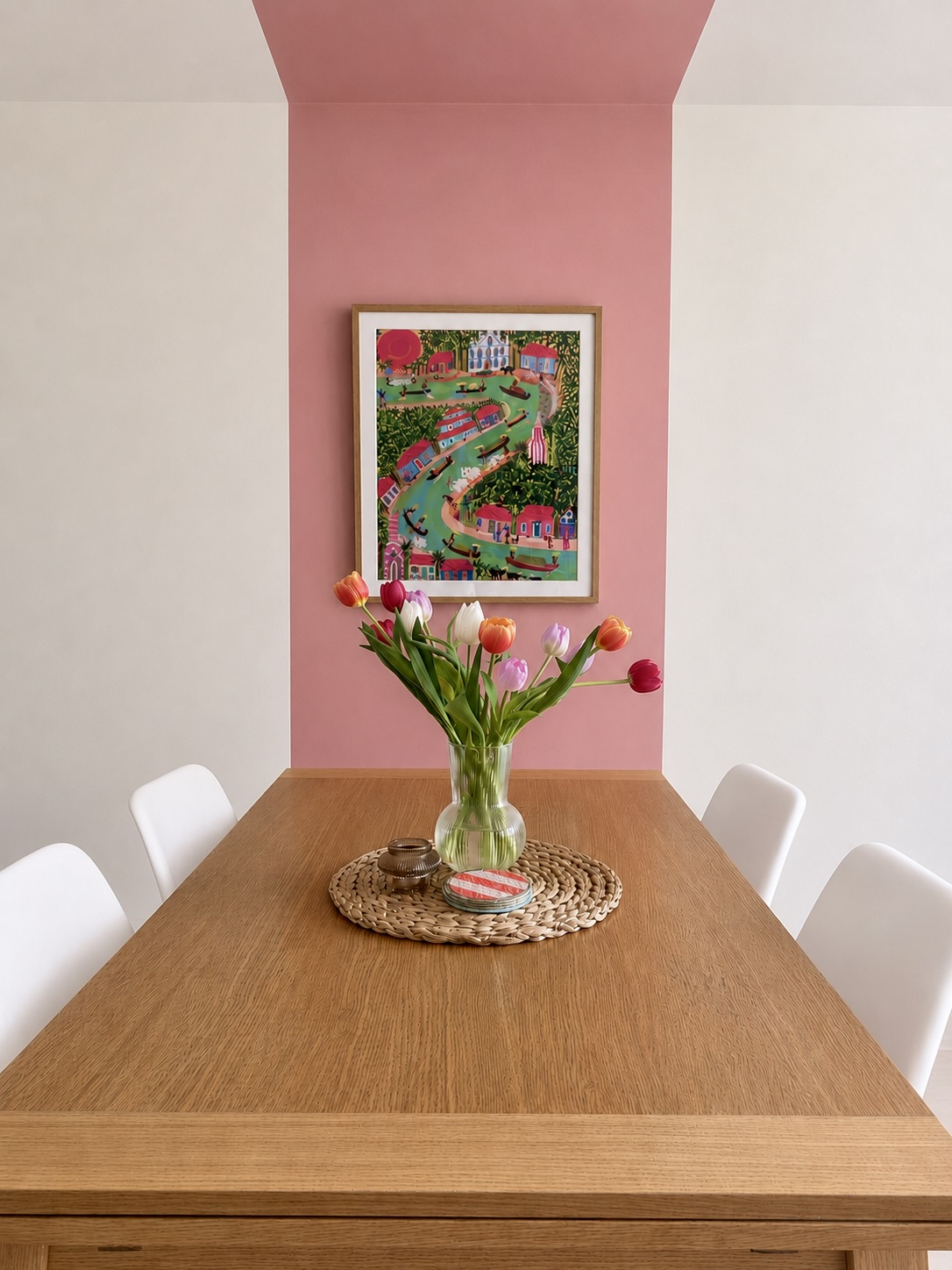
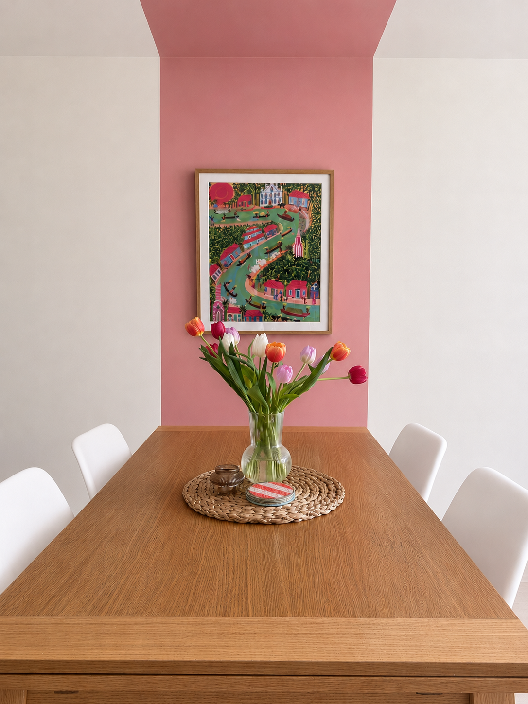
The room is a large, long room so it was important to zone it into different areas to separate the kitchen and dining room. I decided to use a colour block technique in Lick Pink 13, a darker shade of pink, to section off the dining room and add interest to the long white wall when you first walk into the room. I then added the print 'Boats on a Kerala backwater' from King & McGaw. I loved this print as Rob and myself have spent time in Kerala, and the colours worked brilliantly with the pinks and greens in the room. King & McGaw offer a great service where the print comes framed so offers a high-end finish.
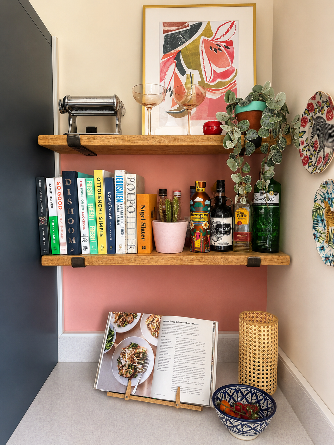
I also used the same colour to add a pop of colour behind the floating shelves in the kitchen to tie the two areas together.
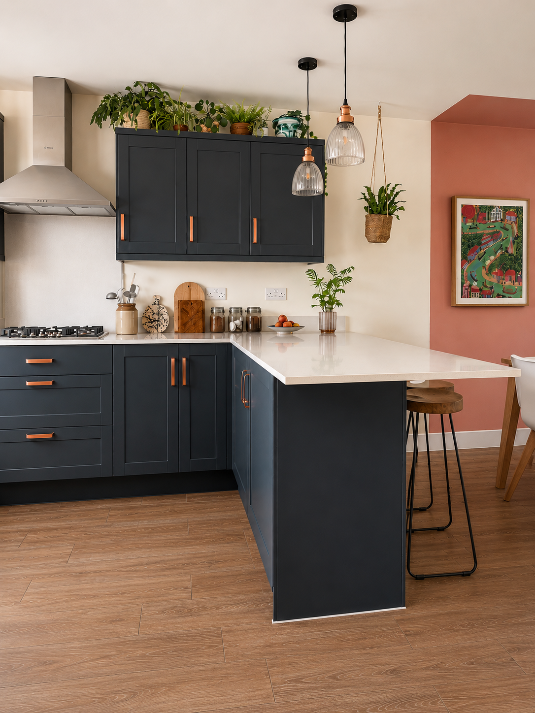
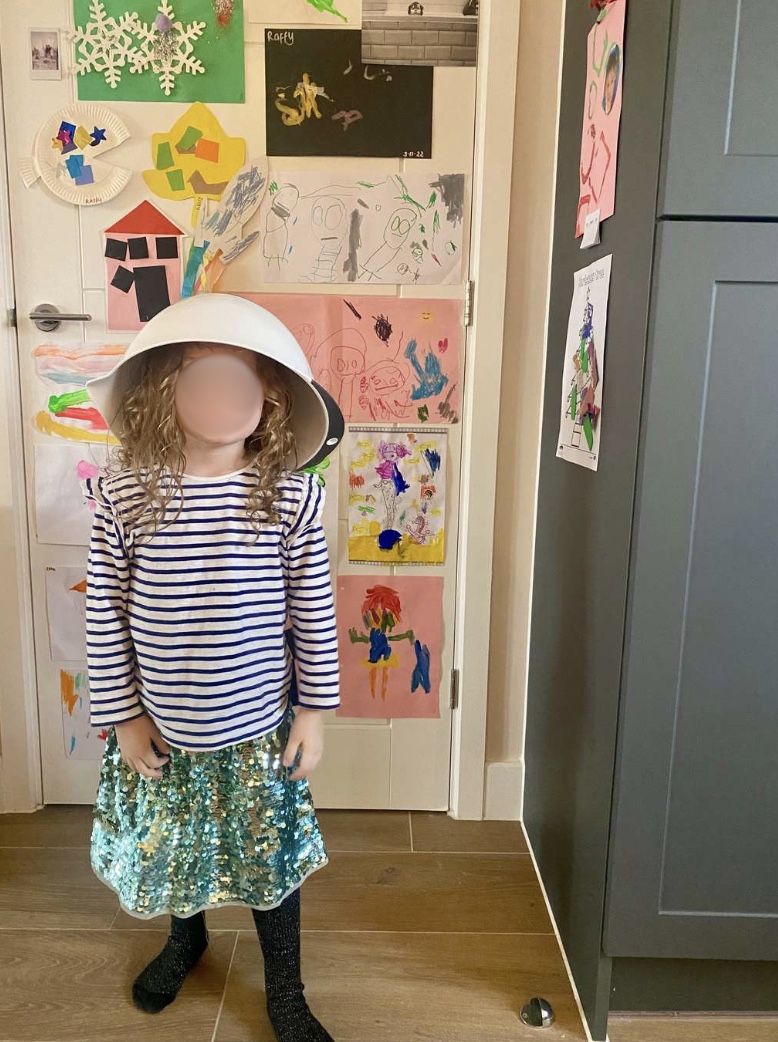
We added artwork that means something to us; a map of the Atlas Mountains from a school trip I ran, a print of a chattel house in Barbados (one of our favourite places) and the famous 'Going to the Match' painting by L.S.Lowry. We also put up our favourite flip clock from Made.com and two pendant lights over the kitchen pensinsula from Industville. I added roman blinds using the made to measure service from 'Blinds 2 Go' in a simple stripe fabric and stuck up lots of the kids art work behind the door and on the side of the fridge. It was starting to feel a lot more like home!
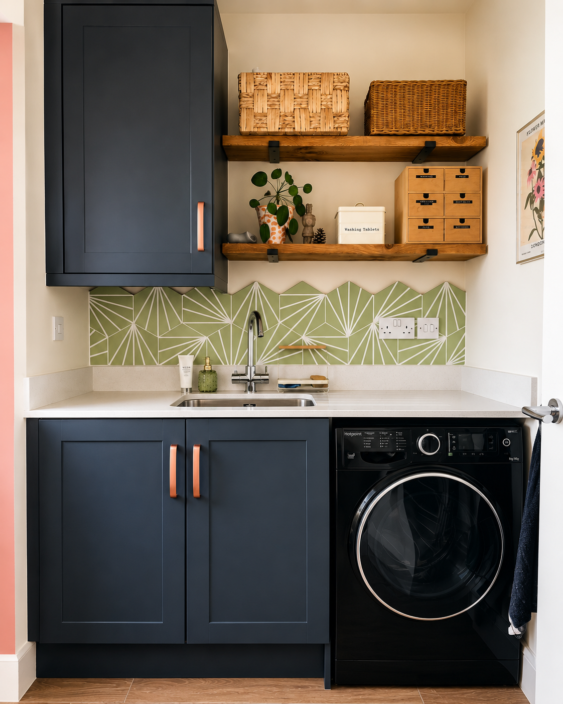
I then extended the Pink 01 colour into the utility room, and used the Pink 13 inside the doorway. I added a tile splashback in green geometric tiles, and some floating shelves.
We have a lot of fun in this room and I was so glad to see the white walls go.